The Design Process
- Oct 20, 2022
- 5 min read
Hey and welcome back to my blog!
This blog is going to discuss the design process and any designs/sketches that have been created thus far.
Face charts vs Sketching

Face charts for makeup artists are like paint brushes for artists - they are an industry staple and are very useful tools that every professional makeup artist should be using.
Traditionally, face charts are done on paper and real makeup is used on them to create makeup looks. However, the world is evolving and so the beauty industry must evolve with it, meaning that digital face charts are now becoming more apparent with at least 32% of makeup artists now using digital apps to create face charts (McAulay, 2018).
Sketching, however, is useful in makeup and wig design because they are done quickly
Figure 1: Example of Face Chart (FacechartAcademy, 2021). and allow the artist to get their initial ideas
down on paper, so that they can then be developed into a full final image (Salwey and Squirrell, 2017).
What designs have been made so far?
Designs have been created for three of the final looks for the major project. A final idea is yet to be designed, however, primary research must be undertaken before an idea can be processed, as the research is going to aid the design for the final image.
Digital sketches have been made for all of the designs. They were made using the app 'ProCreate' on an iPad. This app is extremely good for sketching as there are so many options to use, for example there are a wide range of brushes and to use. Mistakes can easily be undone when creating digital sketches, which is useful when coming up with new ideas.
Design One
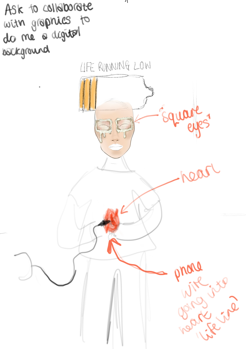
Figure 2 (O'Connor, 2022. Image One Sketch) shows the design idea for the first image of the major project. It includes glued 'square eyes' and a heart with a cable being plugged into it.
Collaboration with graphics will ensure that the final image is going to include a 'digital' background to fit with the theme of technology and a 'Life Running Low' symbol representing that of a battery running low symbol - which everyone knows and hates.
The idea behind this design stems from the old wives tale that states "if you watch too much TV, your eyes will turn square". Throughout childhood this phrase was often said and has seemed to stick in the student's mind. As time has passed, the phrase probably relates more to being on a mobile phone too much, as in recent years people seem to engage more with a mobile phone rather than watching TV. The reason the
Figure 2: Image One Sketch (O'Connor, 2022). 'square eyes' are made to look like they are glued on to the face, is to represent the saying 'glued to your phone'. The heart being plugged in to a cable corresponds with the 'Life Running Low' symbol. This is to represent the fact that in modern societies, mobile phones could be seen as 'lifelines'. People do not like to leave the house without their mobile phone and if forgotten, or if the battery dies, there is an emotional response to this - typically negative.
This image has the potential to be very powerful and have an impact on its audience. This is why the image is going to be in the style of a campaign/advertisement, in order for it to make the audience stop and think about the deeper meanings behind it. The image will be titled 'Glued to your phone'.
Design Two

Figure 3 (O'Connor, 2022. Image Two Sketch) shows the design idea for the second image of the major project. This design is to reflect how people portray themselves differently on their mobile phones than they perhaps would in real life.
The design consists of a silicone mask, which will be realistically painted to look like a 'perfect' human face, with a male model holding the mask, but he will have a black and white body art theme to represent the 'real' him that he does not want to show online. The use of a male model is is in ode to men's mental health awareness.
"40% of men have never spoken to anyone about their mental health" (Priory, n.d.).
The colour black has mainly been used to symbolise negative things; throughout history,
the colour black has represented death and evil. The Figure 3: Image Two Sketch (O'Connor, 2022).
colour black makes an individual feel anger, aggression, fear and sadness (Cherry, 2022). The colour white is often considered a safe and open colour. White is symbolic of peace, cleanliness, purity and salvation (FatRabbit, n.d.). Having both black and white in one image creates a contrast, which represents the good and the bad in the individual's mind and also shows real feelings behind the 'perfect' mask.
The phrase 'putting on a brave face' was in mind when creating this design. The brave face is represented by the mask, and the body art is to represent the pain and hurt that the character is feeling. This image also has the potential to be very powerful and have an impact on the audience, which is why this image is also going to be in the style of a campaign/advertisement. The title of this image will be 'If only you could see inside my phone'.
Design Three

Figure 4 (O'Connor, 2022. Image Three Sketch) shows the design idea for the second image of the major project. This design has been inspired by 'Siri', which is a voice-controlled assistant for Apple users.
The design features a button on the person's arm labelled 'activate'. Once pressed, this will then reveal a hologram of a futuristic character, representing an AI (artificial intelligence) version of Siri.
This design will be presented in the form of a GIF (graphics interchange format) which is a short moving image. This design is to represent what the future of mobile phones/technology could be. More planning needs to go into this design as it has not be thoroughly thought through as of Figure 4: Image Sketch Three (O'Connor, 2022). yet.
Design Four
There are currently no design ideas for the final image just yet. This is okay though, as this project is all about managing time, so the student is trying not to focus on too many things all at once, as this can cause stress and the student can become overwhelmed, which would leave to ineffective project management and will have a negative impact on productivity levels.
Thank you for reading this post!
Until next time,
Alysha:)
Reference List
Cherry, K. (2022) The Colour Psychology of Black [Online]. Available at https://www.verywellmind.com/the-color-psychology-of-black-2795814 (Accessed 10 January 2023).
Facechart Academy. (2021) What are Facecharts Used For? Facechart 101 [Online]. Available at https://facechart.art/blog/2021/9/7/what-are-face-chart-used-for (Accessed 5 January 2023).
FatRabbit. (n.d.) Black and White Colour Theory [Online]. Available at https://www.fatrabbitcreative.com/blog/psychology-of-black-and-white-and-what-they-mean-for-your-business (Accessed 10 January 2023).
McAulay, K. (2018) The End to Paper Face Charts [Online]. Available at https://www.beautypackaging.com/contents/view_experts-opinion/2018-02-01/the-end-to-paper-face-charts(Accessed 5 January 2023).
O'Connor, A. (2022) Image One Sketch [Image].
O'Connor, A. (2022) Image Three Sketch [Image].
O'Connor, A. (2022) Image Two Sketch [Image].
Priory. (n.d.) Mens Mental Health [Online]. Available at https://www.priorygroup.com/blog/40-of-men-wont-talk-to-anyone-about-their-mental-health (Accessed 10 January 2023).
Salwey, J. and Squirrell, L. (2017) About Sketching, New York, Dover Publications Inc.


Comments